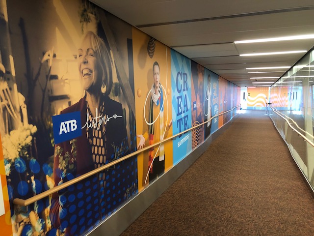
One of the most amazing projects we have been a part of. We had the privilege to work with EIA, ATB, and Makespace, for the rebranding of the Edmonton International Airport. Over 60,000 sq.ft. of wall graphics, installed on various substrates while using a variety of lift equipment, all within a three week timeline!
When we first looked at this project, I thought this would be a straightforward rebrand. Then once Angus and Justin from Makespace shared the art files, I think I was at a point of OMG HELP!!
The art Makespace and ATB put together was so colorful, so many layers, multiple transparencies with spot colors, solid background colors, logo spot color, CMYK color, thin lines traveling in waves over 90’ in length, from wall to wall and around corners; the list goes on and on… making this one of the most, if not the most challenging art pieces I have ever had to produce in my 20 years of experience.
The easy thing to do with these files, as most would do, is just flatten the image, create a tiff file and move on. But when you do that, it limits your production to only print CMYK, not allowing the different channels in the advanced printing equipment like violet, green, and orange to activate. These color additions make the images have the vibrancy, and “pop” and this art needed to have that.
We had over 200 hours in prepress and staging before it went onto our press equipment, but so worth it as an end result. The colors jump at you and makes for quite the impact when you’re walking to and from your plane.
This project has given us some great memories, and the biggest take away for myself and my team was how it challenged every aspect of our knowledge and printing abilities, when we thought we had seen and done it all.
What a rush!
Thanks again to EIA, ATB, and Makespace for the tremendous efforts on this project!


1 Comment
Comments are closed.